Visualising the merger of time-variant and bitemporal data
In the previous post covering bitemporal concepts, we used a Data Vault example in which two satellite tables were combined to create a dimension table.
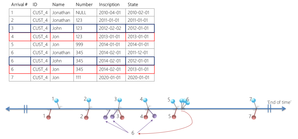
When bringing together these two tables, some very interesting things happened. The resulting combined data set shows two additional records which weren’t visible before in the individual tables. These two records represent a correction on the state timeline, the ‘functional’, or ‘business’ timeline that represents the real world.
This correction, when it was received, applied to a point in time in the past. This caused, a ‘ripple’ effect that re-calculates the history that would have been, if the record was received at the time it applies to.
The outcome is that there are two ‘versions’ of history visible in the dimension, each represent an understanding based on the data that was available, at the time.
This behaviour appears because both satellites were bitemporal. By definition, satellites are are already time-variant (historised).
As a result, the data set has multiple ‘active’ records at the same point in time, illustrated by the image below:

The question posited in the previous post was ‘how can the number value be ‘123’ and ‘345’ at 2012-01-01′? The answer, of course, depends on ‘as of’ when you’re looking at the data. Are you looking at it from today’s perspective (answer: 345), or from the perspective of two years ago (answer: 123).
Joining multiple data sets together for delivery is one of the most common goals for any data solution, and adopting a bitemporal approach really is the way to go – because it allows for corrections on the timeline, as demonstrated in the previous post.
However, the fact that the merger of these two satellites creates the additional two records has been, in my experience, something that puzzles many.
It’s an important concept and worth making sure it’s done right, so let’s look at alternative ways to visualise this behaviour so we can better see what happens, and why these additional records appear.
An easy visual for changes over time
Remember Bob? Bob introduced us to a great visualisation for time-variance, how changes over time (across two timelines) can be plotted on a cartesian plane.
Credits once again go to Dirk Lerner, who fine-tuned this way of visualising bitemporal data to what it is here. Have a look at https://tedamoh.com/en/academy/training/temporal-data for in-depth training on all things bitemporal.
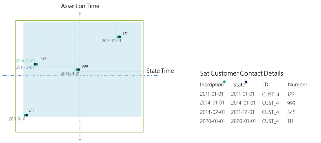
Following the same approach as Bob has taken, we can plot both individual satellites for their assertion- and state timeline. This is the exact same example as used in the previous post, but now more visual.
Plotting the first satellite, containing a linear set of changes, would look like this:

The second satellite, the one that contains the backdated adjustment, would look like this:

In itself, this is perfectly fine, and the same use-case as we saw with Bob.
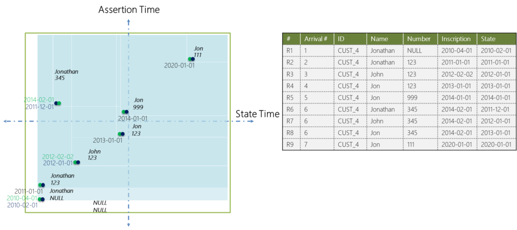
When merging the two satellites, what we’re really doing (in code) is overlaying the two data sets – combining them into one. We can do the same with the above images. When we overlay the first diagram on top of the second one, we can see a combined visual of the data changes.

This is something that is core to Dirk’s training, and as he mentions it is critically important to make sure the scale on both plots is the same. If not, the timelines would not match up!
But, assuming the grids/scale is the same in both plots (which it is in this example), the overlay shows the outcome if you were to combine these data sets – even before you write any code.
Each ‘block’ in the diagram represents a record, and as Bob did, you can go back-and-forth across both the assertion- and state timeline to get the ‘right’ answer depending on your perspective. Always auditable, and always deterministic.
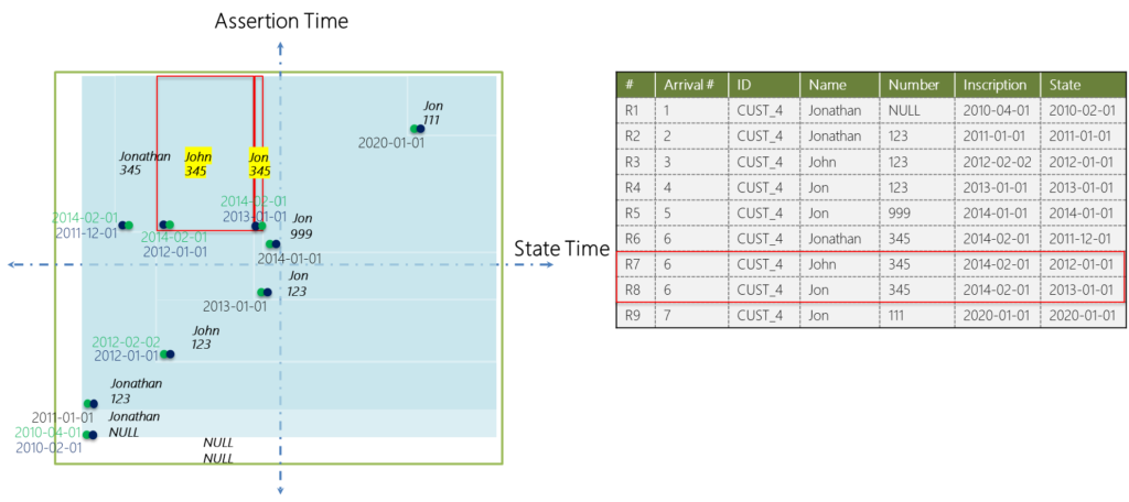
This powerful visual also highlights where the aforementioned two additional records are coming from:

The two highlighted records are the additional rows that appear when combining the two data sets. They are a direct result of overlaying both diagrams, and make it visual how the late-arriving / back-dated record spawns the corrected timeline of changes.
I just wanted to share this way of looking at bitemporal, because I think it’s a great addition to the more data-focused explanation used in the previous post on this topic. Hopefully it explains well why we get these additional records.
Designing your data solution, such as a Data Vault, as bitemporal really is the way to go. With the baseline data set that this approach provides, which is always incremental, always auditable and always deterministic, you have all you ever need deliver the data in any way (e.g. various dimension types etc.) as deemed fit for consumption. As a design pattern, the approach is unrelated to the data delivery requirements, which may change over time too.
If you want to know more on bitemporal, please consider having a look at Dirk Lerner’s work and training (https://tedamoh.com/en/academy/training/temporal-data).
This concludes the introductions in bitemporal, which was needed to circle back on the deterministic delivery of dimension keys. We still need to investigate the effect of these additional record on the (again, deterministic) issuing of keys. This will be the topic of the next post.


